Balahibo Studio Kreatywne

Balahibo.

Identyfikacja Wizulana

The visual identity design for the GET brand is elegant and sophisticated, akin to that created by the product company. The project was commissioned by Łukasiewicz – Institute of Microelectronics and Photonics.

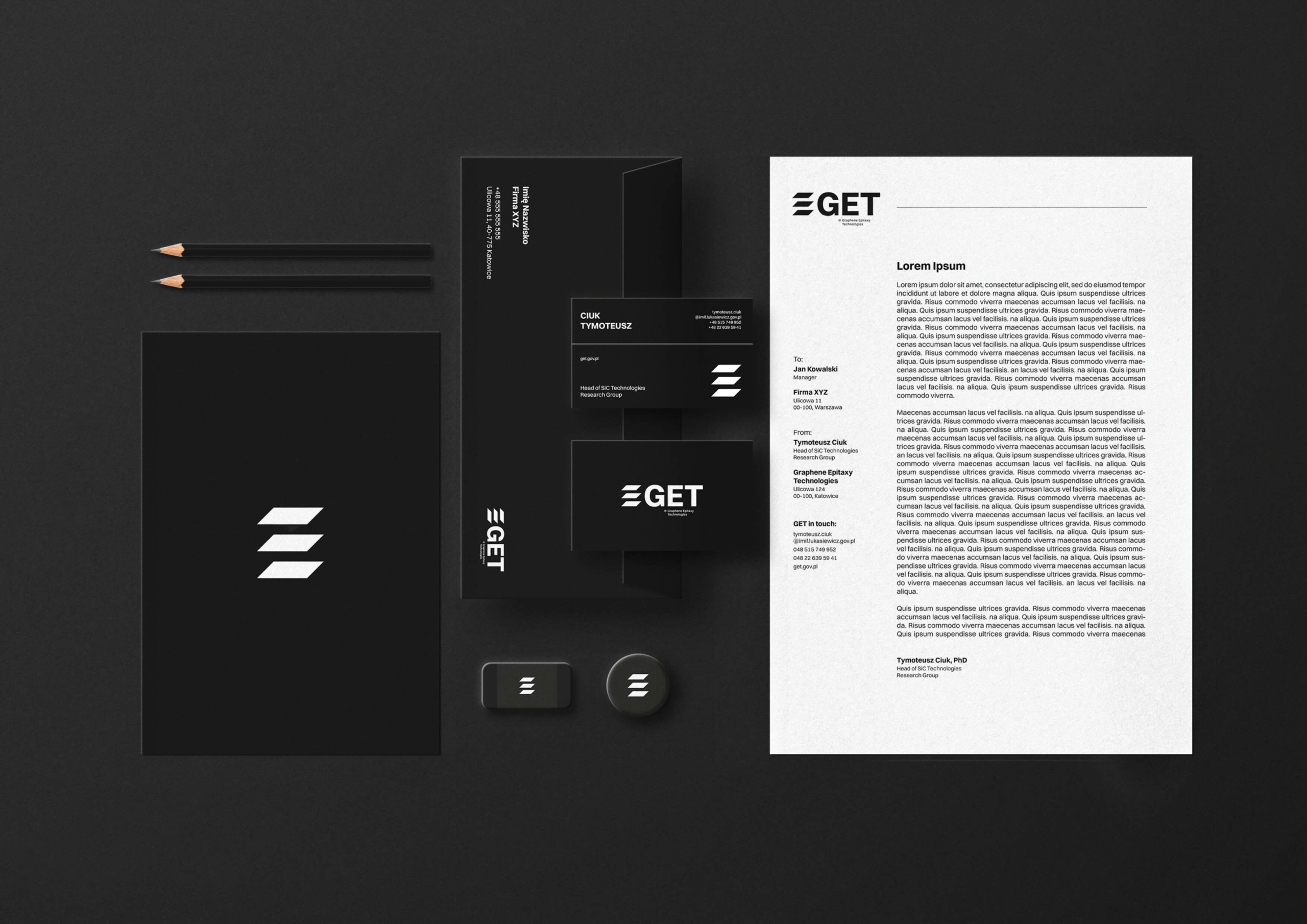
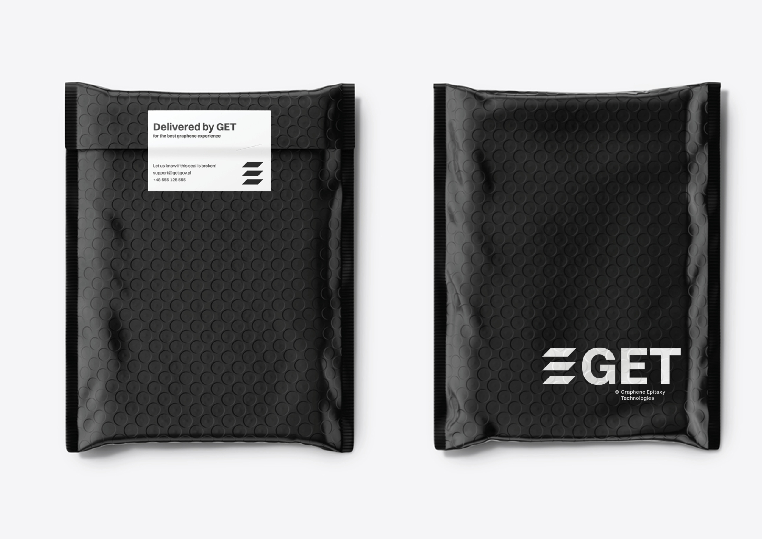
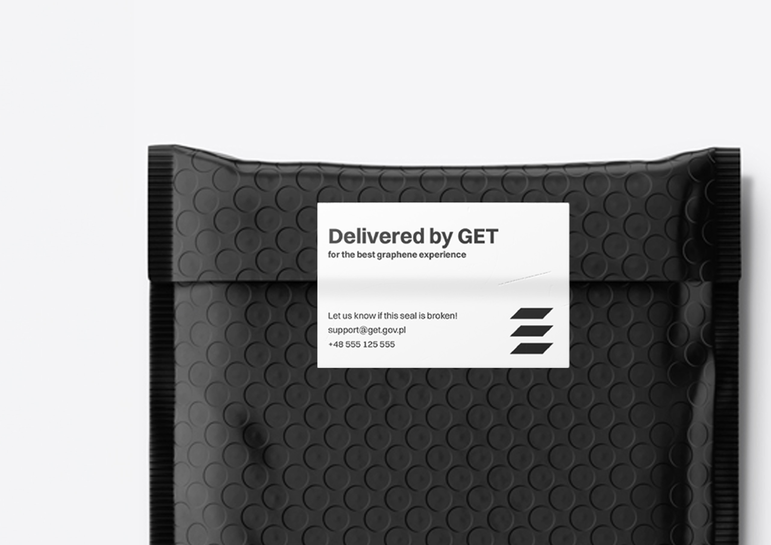
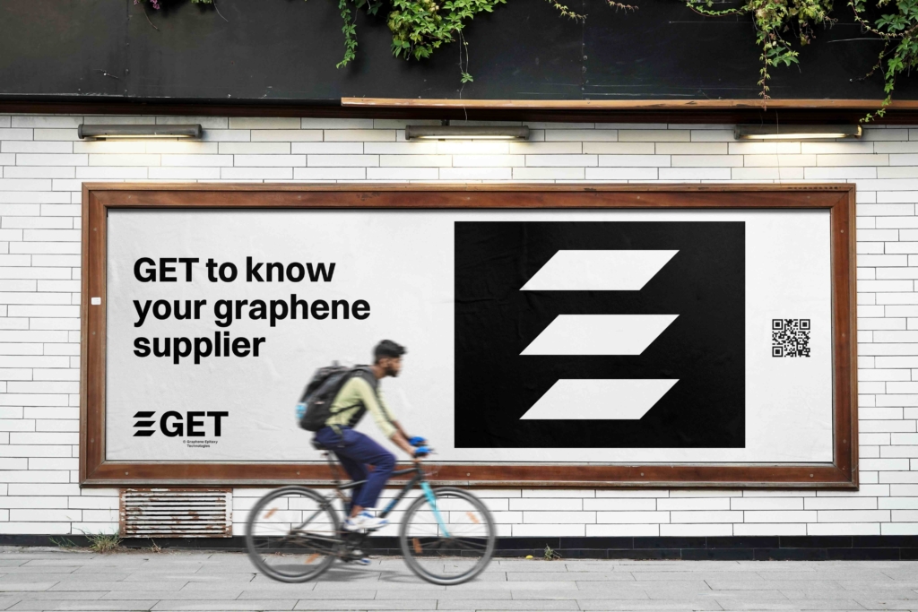
The graphic symbol is unconventional, elegant, and minimalist, reflecting the three product layers through three trapezoids. The acronym GET, based on the Switzer typeface in bold, allows for seamless integration of the brand name with advertising messages, as seen in slogans like „GET to know your graphene supplier.”

Colors

Due to its high elegance and minimalism, the visual identity project does not involve the use of colors other than black, white, and the shade of gray specified later in the brand book. This applies to the logos of other brands appearing on materials promoted or created by GET; they should also be in their achromatic or monochromatic versions.

Packaging

We have decided to create packaging in the form of secure black envelopes with labeling. Additionally, we have designed a seal to confirm that the product is intact.

The symbol has three versions, and we made this decision due to the diverse surfaces of use and varying sizes. The brand can use the symbol alone, the symbol with an abbreviation, and a version with an extended form.

The use of uppercase letters allows for associating the brand name with a „hidden” message in promotional materials (e.g., GET to know your graphene supplier).