Visual Identification for Karolina Wytrych - Profesional speach therapist from Katowice.
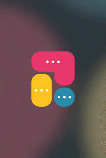
The sign reflects speech bubbles that symbolize a lively conversation between a speech therapist and a patient. The color scheme strongly refers to the target audience, which consists of young people.
Typography
In this project, we chose to use the Helvetica font for its timeless elegance and unparalleled readability, ensuring that our message is communicated clearly and effectively to all audiences.
Decisions
The sign itself, with its speech bubbles, serves as a powerful symbol of open dialogue and connection, perfectly capturing the essence of communication between a speech therapist and their patients.
We've also created a simple, one-page informative website about products and brand
Summary
This vibrant logo, featuring speech bubbles, embodies the essence of engaging conversations between a speech therapist and their patients. With a color scheme thoughtfully chosen to appeal to younger audiences, it captures the dynamic and supportive nature of speech therapy. Perfect for representing services focused on improving communication skills, this logo resonates with the energy and optimism of youth, inviting them into a world where every voice is heard and valued.